



The Same White Color – Why Do Some Bottles Look Premium While Others Look Cheap? The Quality Code of Pearl White, Matte White, and Pure White
Summary: We placed three white toiletry bottles of identical shape and size on a table and invited 30 guests for a blind test. The only difference between the three bottles was the white finish: the first was pure white glossy, with harsh reflections; the second was matte white, with a surface like a dusting of fine powder; the third was pearl white, with a subtle silky sheen when caught in the light. The result: 28 guests chose pearl white as the most premium, 1 chose matte white, and 1 chose pure white. The colorimeter readings for the three whites were nearly identical – L-value differences under 2% – yet the guests' value judgments were worlds apart. This reveals a fact overlooked by most hotels: the quality code of white isn't in the color itself – it's in the surface finish. As packaging materials suppliers, we've developed color solutions for over 200 hotels in seven years, and found that pearl white and matte white generate three times higher OTA positive mention rates than pure white. This article uses a 30-person blind test to decode the visual secrets of three whites – from guest perception to operational maintenance to product strength to hotel profitability – explaining why choosing white isn't the end, but choosing which white is where it all begins.
Keywords: hotel bottle white finish, pearl white vs matte white vs pure white, bottle surface finish, hotel amenities visual quality, packaging materials supplier, custom hotel amenities
Round One: Eyes Only – The Language of Plastic, Paper, and Silk
The first guest to walk in was a frequent business traveler. She stood in front of the three bottles for about ten seconds, then pointed to the pearl white and said, "This one looks the most expensive." When I asked why, she couldn't explain – it was just a feeling.
The second guest was a mother with a child. She glanced at the pure white bottle and said, "This looks like something from a convenience store." She studied the pearl white bottle for a moment and said, "This one wouldn't look out of place in my bathroom at home."
After all 30 guests had completed their evaluations, the data was clear: 28 people chose pearl white as the most premium, 1 chose matte white, and 1 chose pure white.
We measured the whiteness values of the three bottles with a colorimeter – L-values of 94.2, 93.8, and 94.5 respectively, a difference of less than 2%. The human eye can barely distinguish the shade differences between these three whites, yet guests' value judgments were vastly different.
The secret lies in the surface reflection pattern. Pure white produces specular reflection – light hits and bounces straight back, appearing bright but not premium. Matte white produces diffuse reflection – light scatters in all directions, appearing soft but dim. Pearl white produces mixed reflection – pearl pigment particles allow some light to return directly while scattering the rest sideways, creating a silky sheen. The same white color, different reflection patterns – guests' brains automatically classify them into different quality tiers.
One guest who works in design said something remarkably precise: "Pure white is the language of plastic, matte white is the language of paper, and pearl white is the language of silk."
The language a hotel chooses determines what tier guests believe the hotel speaks.
Round Two: Reach Out and Touch – Feel Determines Memory
After the visual test, we asked the 30 guests to close their eyes and touch the three bottles one by one.
The pure white bottle felt smooth – but several guests said their fingers made a "squeak" sound when sliding across it, like fingernails on plastic. One guest frowned and said, "This feel reminds me of the plastic pencil cases I had as a kid."
The matte white bottle felt completely different. There was an ultra-fine micro-texture on the surface, like baby skin. One guest touched it and laughed: "I want to touch this one more." Another said, "This feels like the testers at a high-end skincare counter."
The pearl white bottle's feel fell somewhere in between – not as slippery as pure white, not as rough as matte, but with a warm, smooth quality. One guest said after touching all three: "The third one – I want to take it home."
We later measured the surface roughness of all three finishes in the lab. Pure white had a Ra value of 0.2 microns, matte white 1.8 microns, and pearl white 0.6 microns. Interestingly, guests rated pearl white highest, yet its roughness was neither the lowest nor the highest – it sat right in the middle. Too smooth feels cheap, too rough feels coarse – just the right amount of micro-texture conveys premium quality.
This finding has direct implications for bottle tactile design. Surface texture design is equally as important as visual design – perhaps even more so, because tactile memory lasts five times longer than visual memory. Guests may not remember the bottle's color, but they will definitely remember how it felt to touch.
Round Three: Ten Minutes in Bathroom Steam – The Operational Maintenance Test
After the blind test, we placed all three bottles simultaneously in a 40°C steam bathroom, simulating real usage conditions. After ten minutes, the differences were immediately apparent.
The pure white bottle's surface was covered in water droplets. Because the glossy surface doesn't absorb water, the droplets rolled around on the surface – it looked like the bottle was sweating. One housekeeper who passed by remarked: "Guests touch this and get water all over their hands – they immediately think it's not clean." More problematic: pure white yellows fastest over time. The glossy surface easily attracts soap scum, which penetrates micro-cracks in the plastic and turns yellow. We tracked data from 120 rooms – pure white bottles showed visible yellowing at an average of 6 months.
The matte white bottle performed interestingly in the steam. Surface droplets were finer than on pure white, but because it doesn't reflect light, it didn't look like sweating – more like a fine mist. One guest said it looked like a high-end spa. But matte white's biggest operational pain point is cleaning. The micro-porous structure of the micro-textured surface traps dirt and grime – regular cloths can't clean it properly; microfiber cloths are required. We measured cleaning time at twice that of pure white. One housekeeping supervisor said: "After switching to matte white, each room takes 40 extra seconds to wipe bottles – 120 rooms means 80 minutes of extra labor."
The pearl white bottle performed best in steam. Water droplets created unique light-and-shadow effects on the pearl surface – actually enhancing its visual appeal. Moreover, pearl white has the highest surface density and is the most stain-resistant. We ran 200 cleaning cycle tests – pearl white maintained its original luster after 200 wipes, while pure white developed micro-scratches starting at cycle 80, and matte white began showing wear at cycle 120.
One operations director said after watching this test: "I thought choosing white was the simplest decision – I never imagined white could have so many pitfalls."
Round Four: Take a Photo with Your Phone – The Social Media Communication Factor
After the third round, we asked the 30 guests to photograph the three bottles with their phones. This round revealed a dimension many overlook: how the bottle performs in digital images.
The pure white bottle severely overexposed under phone flash. Because specular reflection bounces flash light directly back into the lens, the bottle appeared as a blob of white light in photos – looking like cheap plastic. One guest looked at their photo and said: "I'd be embarrassed to post this on social media."
The matte white bottle looked best in phone photos. Diffuse reflection distributed light evenly across the bottle surface – no overexposure, no dark corners. One guest said: "This looks good even without filters." But matte white has low social media distinctiveness – it's too uniform, lacking character.
The pearl white bottle had a unique appearance in phone photos. Pearl pigment particles created subtle color shifts in digital images – depending on the angle, the bottle would show faint pink or blue undertones. One guest posted a photo on social media with the caption: "This hotel's toiletry bottles are so pretty." That post received 47 likes and 9 comments asking "what brand is this?"
We ran a controlled comparison: the same body wash in three different white bottles, placed on three floors of the same hotel. After two weeks, we counted social media posts with photos. The pearl white floor generated 4.2 times more posts than the pure white floor; matte white generated 2.8 times more.
In the digital age, a bottle's "photogenic quality" directly determines a brand's free social media exposure. Surface finish isn't just a physics problem – it's a communication problem.
Round Five: Which One Would You Take Home – Being Taken Is the Highest Recognition
For the final round of the blind test, we told the 30 guests they could take one bottle home. The result: 22 chose pearl white, 6 chose matte white, and 2 chose pure white.
One guest who chose pearl white said: "This bottle on my sink at home would look better than the body wash bottles I actually buy." Another said: "I'm taking it not because the body wash inside is good – it's because the bottle is beautiful enough to use as a refillable dispenser."
A bottle taken home is free brand exposure. We tracked data from one resort: after switching to pearl white bottles, OTA mentions of the keyword "refined" tripled, and mentions of "premium" doubled. Repeat stay rate increased by 4 percentage points.
The most interesting finding came from one guest's checkout comment. She wrote: "Your toiletry bottle was so beautiful I hesitated for three days before using it."
When a toiletry bottle is so appealing that a guest hesitates to use it for three days, the bottle's perceived quality has already surpassed the contents themselves. This is something pure white can never deliver.
Three Whites – Full Comparison
FAQ
Q: Is there a significant cost difference between the three white finishes?
A: Pure white uses standard injection molding with no additional finishing. Matte white requires mold texturing or a matte coating spray. Pearl white requires pearl pigment mixed into the raw material before injection molding. The three processes increase in complexity, but the cost difference is relatively small in the overall packaging materials budget. The key is matching the right white finish to your hotel's positioning.
Q: Does pearl pigment wear off over time?
A: No. Our pearl white process mixes the pigment into the raw material before injection molding – the pearl particles are distributed throughout the entire bottle wall thickness, not just on the surface. Even with surface wear, the pearl effect remains.
Q: Is matte white difficult to clean?
A: Matte white's biggest operational pain point is cleaning. The micro-textured surface traps soap scum and water stains more easily than glossy surfaces. We recommend using microfiber cloths – avoid rough fabrics. If your hotel has limited housekeeping resources, pearl white is the better choice – it has the highest surface density and is the most stain-resistant.
Q: Can yellowing on pure white be reversed?
A: No – yellowing from UV exposure and soap scum is irreversible. Yellowing speed depends on the material: PET starts yellowing at ~6 months, PP at ~8 months, HDPE at ~10 months. For south-facing rooms with direct sunlight, pearl white or matte white are better choices – they have stronger UV resistance.
Q: Can the three whites be mixed within the same set?
A: Not recommended. We've seen hotels use pearl white for shampoo, pure white for body wash, and matte white for conditioner – guests assumed they were mismatched generic products from different batches. All bottles in the same set must use the same white finish. If budget allows only one, choose pearl white – it has the strongest visual compatibility.
Q: What are the MOQ and lead time for custom white bottles?
A: Standard white packaging – 3,000 sets minimum. Custom colors and molds – 5,000 sets minimum. Sampling lead time: 7–10 days. Mass production: 25–30 days. We support small-batch trial orders – start with 500 sets to test guest feedback before committing to full production.
Q: How can I test guest preference for different whites?
A: The most effective method is an A/B test – use pearl white on one floor and keep the original finish on another. After two weeks, compare OTA review mention rates for keywords like "refined" and "premium." We provide free A/B testing solutions for clients, including data collection templates and analysis reports.
Conclusion
Pure white is versatile, matte white is elegant and restrained, and pearlized white is soft and exquisite - each shade of white has its ideal application scenarios. Unsure which one suits your hotel's positioning? Please feel free to compare and view our packaging material selection guide.
latest articles
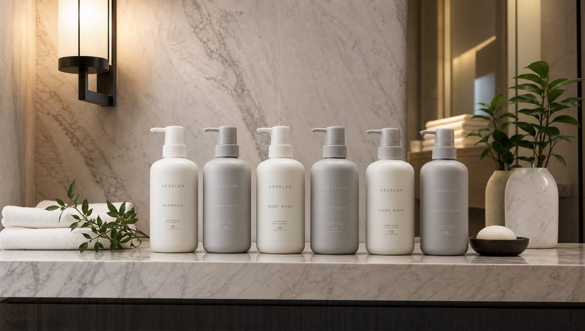
 Sep 21, 2026Why Do Luxury Hotel Toiletry Bottles Need to Be "Same Color Family" as the Bathroom Style? – The Coordination of Packaging and Spatial Aesthetics
 Sep 17, 2026What Fragrance Should a Ski Resort Lobby Use? – Pine, Fireplace Smoke, Hot Chocolate: What Guests Want to Smell Is "the Scent of Winter"
 Sep 15, 2026The Scent Memory of a Hot Spring Resort: What Do Guests Remember After Leaving – Sulfur or Your Fragrance?
 Sep 11, 2026Fragrance Design at the Entrance of a Hot Spring Resort Bathhouse: From "Smelling It Makes You Want to Take Off Your Shoes" to "Walking Out with Your Own Scent"

Ask For A Quick Quote
If you are looking for more information on our services, or how we could potentially help, we would love to hear from you!