



Why Do Luxury Hotel Toiletry Bottles Need to Be "Same Color Family" as the Bathroom Style? – The Coordination of Packaging and Spatial Aesthetics
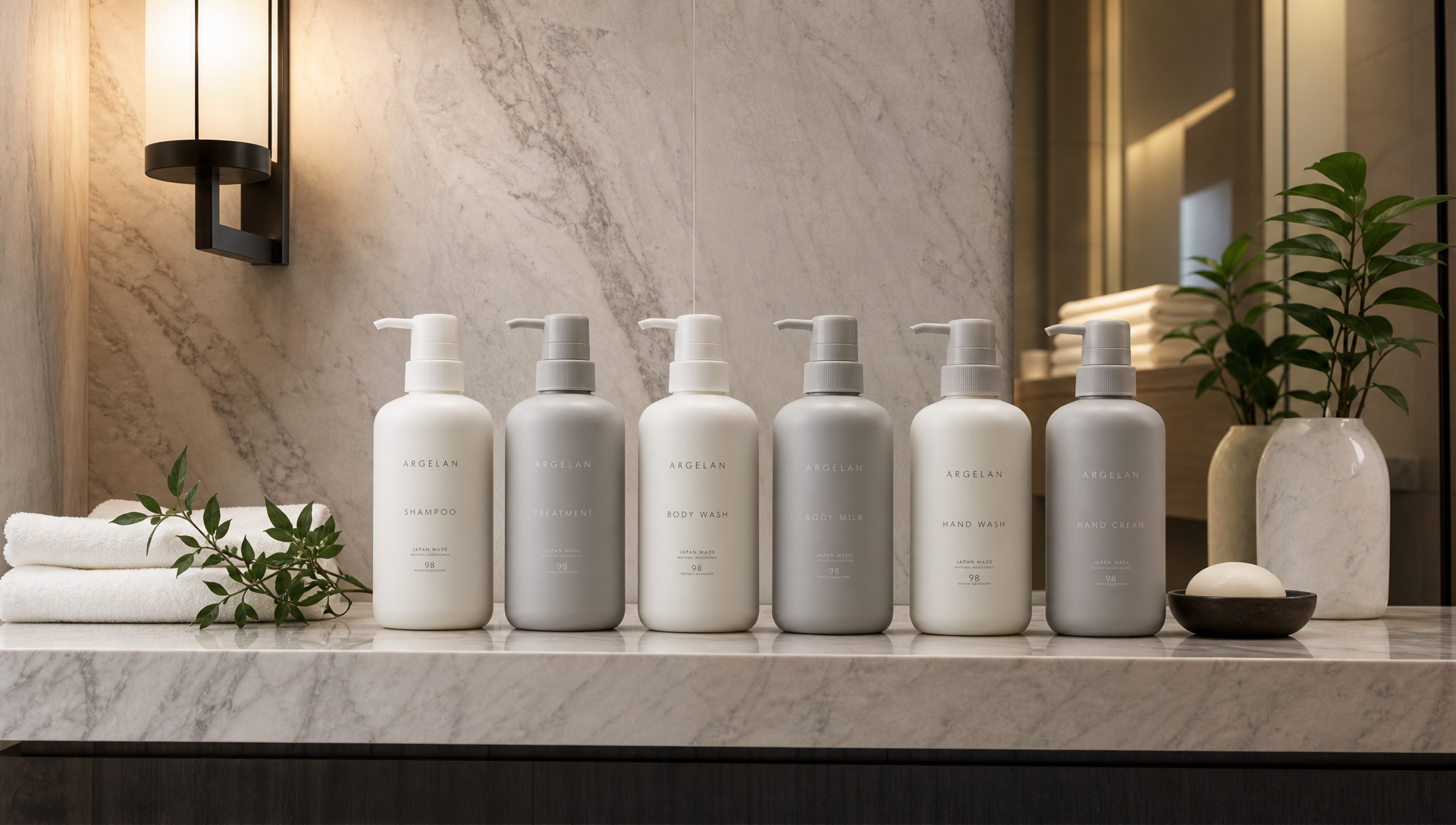
The bathroom has just been renovated – grey-white marble with warm lighting. But the row of bright orange amenity bottles on the countertop is still the old version. Under the light, the bottles and the space undermine each other. More and more luxury hotels care about this: making packaging and spatial aesthetics coordinate. Same color family is not simply changing a color – it is deriving material, brightness, and texture backward from the spatial color card. This article explains this coordination homework from four perspectives: guest experience, hotel operations, product competitiveness, and profitability.
Guest Experience: The Largest Item on the Countertop Cannot Sing a Different Tune
Guests do not study color cards – but their eyes vote.
A row of bright orange bottles on a grey-white marble countertop – guests cannot say what is wrong, but their hands hesitate before taking a photo.
Once the color family is unified, a casual shot by the bathtub can be used directly as hotel promotional material.
In a minimalist space, the bottle color is part of the soft furnishing. Singing a different tune is exposing one's own weakness.
Photo-loving guests will deliberately include amenities in the frame – a unified color family makes the entire photo work.
Hotel Operations: Same Color Family Is Not the Same Color – It Is the Same Tone
The truly sophisticated approach is not painting the bottle the same color as the wall tile – it is making brightness and texture stand on the same side. Matte tiles pair with matte bottles. Glossy hardware pairs with fine highlights. When the material language is consistent, color differences do not feel out of place. In the packaging industry, this is called texture alignment – simply put, the way the bottle reflects light must speak the same dialect as the way the space reflects light.
Hotel Operations: Unified Color Scheme Makes Restocking and Inventory Faster
Operations also benefit – unification is not just about looking good.
Color-code by room type: suites in deep tones, standard rooms in light tones. Housekeeping knows at a glance whether it was placed correctly.
Batch-to-batch color differences are minimized under unified color code management – mixed placement does not give anything away.
When checking goods by photo, whether same-color-family bottles are aligned on the countertop is immediately obvious.
Product Competitiveness: Colors Must Be Derived Backward from the Spatial Color Card
When customising toiletry bottles, the correct order is to obtain the spatial color card first, then derive the bottle material and color backward. Frosted, aluminum tube, and biodegradable bottles each have their own material language – pairing wrong is wasted effort. Pump heads and accessories must lock to the same color code. Color difference is the most easily visible flaw on the countertop.
Profitability: Renovation Without Tearing Everything Down
The profitability equation is simple: packaging follows soft furnishing. When the bathroom is renovated, only the bottle solution is changed – formula and moulds stay untouched. Renovation cycles are staggered, and inventory pressure is small. Photos taken by guests are free promotion. One line in a review saying "the bathroom photographs beautifully" is worth more than any advertisement. The coordination of spatial aesthetics ultimately lands in two places: guests are willing to take photos, and the hotel saves effort.
Frequently Asked Questions
Q: Does a same color family make amenities look monotonous?
A: No. Same tone, different colors actually create layers. Differentiation comes from material texture – alternating matte and gloss is more durable than random color schemes.
Q: With a limited renovation budget for an old bathroom, is changing only the bottles enough?
A: Yes. Changing toiletry bottles is the least effort-intensive coordination action. Formula and pumps remain, and the color moves one step toward the spatial tone – the visual impression improves immediately.
Q: What bottles suit a dark bathroom?
A: Matte black or deep amber, with same-color-code pump heads. Under light, layering comes from embossing and matte finish. Avoid glossy reflections that glare.
Q: How should multi-brand groups manage this uniformly?
A: Establish a color code library. Write the bottle colors and materials corresponding to common spatial tones into standards. New properties apply them directly. Acceptance is compared against the color card.
Browse our Hotel Bathroom Same-Color-Family Packaging Wholesale Collection – from bottle color schemes to custom color code management, and full private-label solutions, all covered in one stop. Our flexible production line supports small-batch orders with flexible MOQs.
latest articles
 Sep 21, 2026Why Do Luxury Hotel Toiletry Bottles Need to Be "Same Color Family" as the Bathroom Style? – The Coordination of Packaging and Spatial Aesthetics
 Sep 17, 2026What Fragrance Should a Ski Resort Lobby Use? – Pine, Fireplace Smoke, Hot Chocolate: What Guests Want to Smell Is "the Scent of Winter"
 Sep 15, 2026The Scent Memory of a Hot Spring Resort: What Do Guests Remember After Leaving – Sulfur or Your Fragrance?
 Sep 11, 2026Fragrance Design at the Entrance of a Hot Spring Resort Bathhouse: From "Smelling It Makes You Want to Take Off Your Shoes" to "Walking Out with Your Own Scent"

Ask For A Quick Quote
If you are looking for more information on our services, or how we could potentially help, we would love to hear from you!